 |
|
Magazine Spread
Christian Witkin
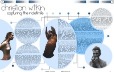
Our assignment was to take copy from one magazine and design a layout using another magazine's form. I found an article about photgrapher Christian Witkin in Juxtapose and used Artbyte as my defining layout.
Artbyte is modern/digital culture magazine. The article on Witkin really seemed to work well as his photographs are all about capturing specific "timeless" moments in life.
I designed the typeface for the heading (Circeline) and used photographs from the article in Juxtapose. I used different shaped text-containers, common in Artbyte, all revolving around the circle (infinite=timeless). The resulting layout is very cool, modern and a bit sci-fi without going overboard. |
|
. |

Click to enlarge |
 |
|