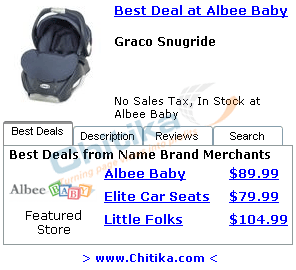
Analysis of Chitika EminimallsDecember 12, 2005 Recently, within the past month or so, I came across some really interesting online marketing. The effort came in the form of online ads which I couldn't really fit into any one category. Part pay-per-click ad, part banner ad, part "mini utility javascript", and really pretty eye-catching. It turns out the ads are part of Chitika's Eminimalls online advertising campaign. I saw the "ad" at the top of a page on a, I believe, news site. Perhaps it was a news article reviewing a certain product or giving information about a certain manufacturer, I cannot remember exactly. But I read the article and then looked around the page and saw the "ad", which didn't really seem to fit in with the site's graphics and design. While the ad didn't necessarily fit in with the site design-wise (perhaps a clever strategy), it did look sharp and certainly caught my attention. Once I delved into the ad even further I found I was pleasantly surprised. The ad was actually a javascript "app". You can scroll over certain tabbed "headlines" and the main ad area would change. Not only that, but the changes weren't simply static graphics, but almost "mini websites" inside a banner-ad sized frame. It was really cool. Basically Chitika is a product showcase ad. Once you have an account with them, you can select certain products or product areas you'd like to "sell" on your site via the Chitika styled ads and they generate a javascript for you to put on your site. The concept is similar to Google's Adsense for content publishers. What's different though is the "coolness factor" of the ads themselves. Instead of just being plain text ads, or better yet even static gif/jpeg banner ads, they are interactive "Eminimalls". The ads are separated by 4 tabs - Best Deals, Description, Reviews, and Search. The Best Deals (default) tab shows a thumbnail of the product along with a few links to websites that carry the product along with the price! It's almost having a personal My Simon shopping utility that highlights a certain product, lists out websites that carry the product, shows you the price of the product on each website, and even has a link so you can easily get to the website to a specified product page. The Description tag is self-descriptive, and the Review tab gives a quick blurb highlighting a review from a (random?) website along with a link to the entire review. Finally the Search tab acts as a product finder that returns results right inside the same Chitika ad, you don't even have to go to a different "results" web page! The result is a very nice little self-containted "ad/app" that let's users get product info very quickly and with no hassle. From what I can tell, publishers can select certain products to advertise, or can have the products generated depending on the content of the page the ads are placed on. When a visitor clicks on a product and eventually buys it, the publisher (and Chitika) make a profit off of the purchase. It works almost like a referrer type program with Chitika being the middle-man that supplies the referrer with really nice looking product placements. I would say this is the next evolution of "virtual online coupons" and should have a very strong impact on how referral programs are run. There are thousands and thousands of these online coupon referral sites. Basically a publisher signs up for a referral program at a shopping site and the site gives them access to link code that points visitors back to the shopping site for a certain deal/product. If a visitor gets to the shopping site via the link from the publishers site and ends up buying that product, the referrer gets a small commission from the shopping site. Chitika is using the same principal only taking the virtual online coupon idea to the next level. Instead of a plain old link highlighting a special deal, you get graphics, reviews, images, and price comparisons all in the same ad. Now, I'm not going to say Chitika is going to change the landscape of the Internet, but it is really cool technology. I'm starting to see the ads on more websites and I can see the appeal for any content publisher who is able to "push" any kind of consumer product. These ads are way cooler than the Google "plain-Jane" plain text Adsense ads and represent a very novel form of product advertising. What I will say (and have said in a previous article) is that Google needs to get going presenting the general public with online marketing ideas like this if they want to stay at the forefront of Internet-related businesses. If Google and Chitika were both new companies, I would take the Chitika ads for my website any day over the Google ads. Technorati Tags: chitika chitika eminimalls online marketing online advertising pay-per-click ads |


